Brazil has one of the highest murder rates in the world. In 2015, the there were nearly 60,000 murders in the country. The following chart shows this number in perspective. This number is equal to the number of murders in the US, China, all of Europe, Northern Africa, Japan, Indonesia, Australia, Canada, and New Zealand combined.
Click to enlarge
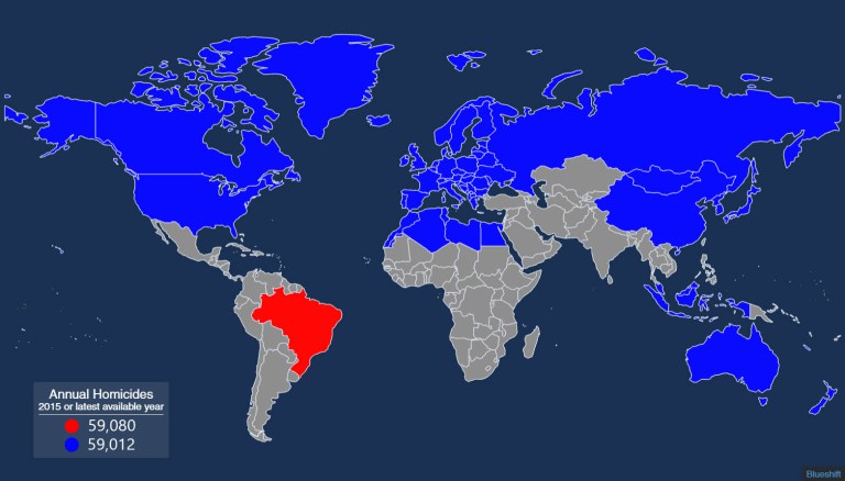
Source:Brazil has nearly 60,000 murders a year — here’s a map to put that number in perspective, Metrocosm
Sometimes a chart or graph is needed in order to clearly show the significance of abstract numbers. The above chart proves that point.
The more interesting question is why Brazil has such a high murder rate compared to other countries.