The Historical Average Annual Returns of Australian Stock Market From 1900 To 2023

The Australian stock market as measured by the The ASX All Ords index has returned 13% per year for the duration from 1900 to 2023 according to the updated chart from ASX. This return indicates total return which includes dividends reinvested. Of course, no investor invests for such a long term. However the key point to remember from such charts is the importance of investing for the long-term which can mean different time for investors depending on their risk tolerance. It can be as low as 5 years to a few decades.

For the latest chart click: Average Annual Returns of Australian Stock Market from 1900 to 2024

Australian stocks have generated positive returns in 100 of the 124 years as shown in the chart below. To put it another way that is 81% of the time from 1900 to 2023.

Click to enlarge 
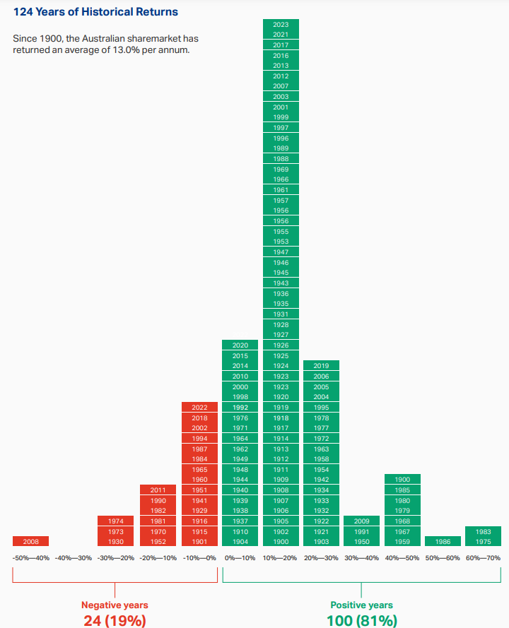
Source: ASX via Why I’m a perma-bull on stocks by James Gruber, Firstlinks

James also noted another fascinating fact in the above article. If an investor holds stocks for seven years or longer, the chances of earning a positive return in Australia and other global markets is nearly 100%.

The following table shows the Annual Total Returns of Australian Stock Market from 1900 to 2023:

Click to enlarge
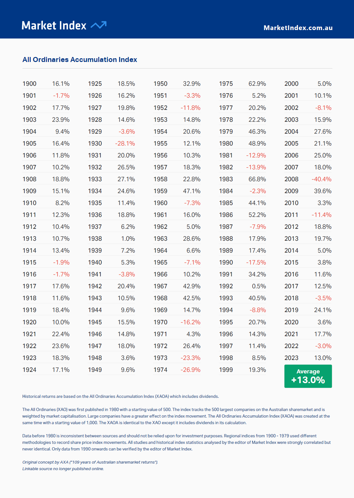
Source: Market Index

Download:

Related ETFs and ADRs:

Disclosure: No positions

Cigarette Taxes in Europe, 2024: Chart

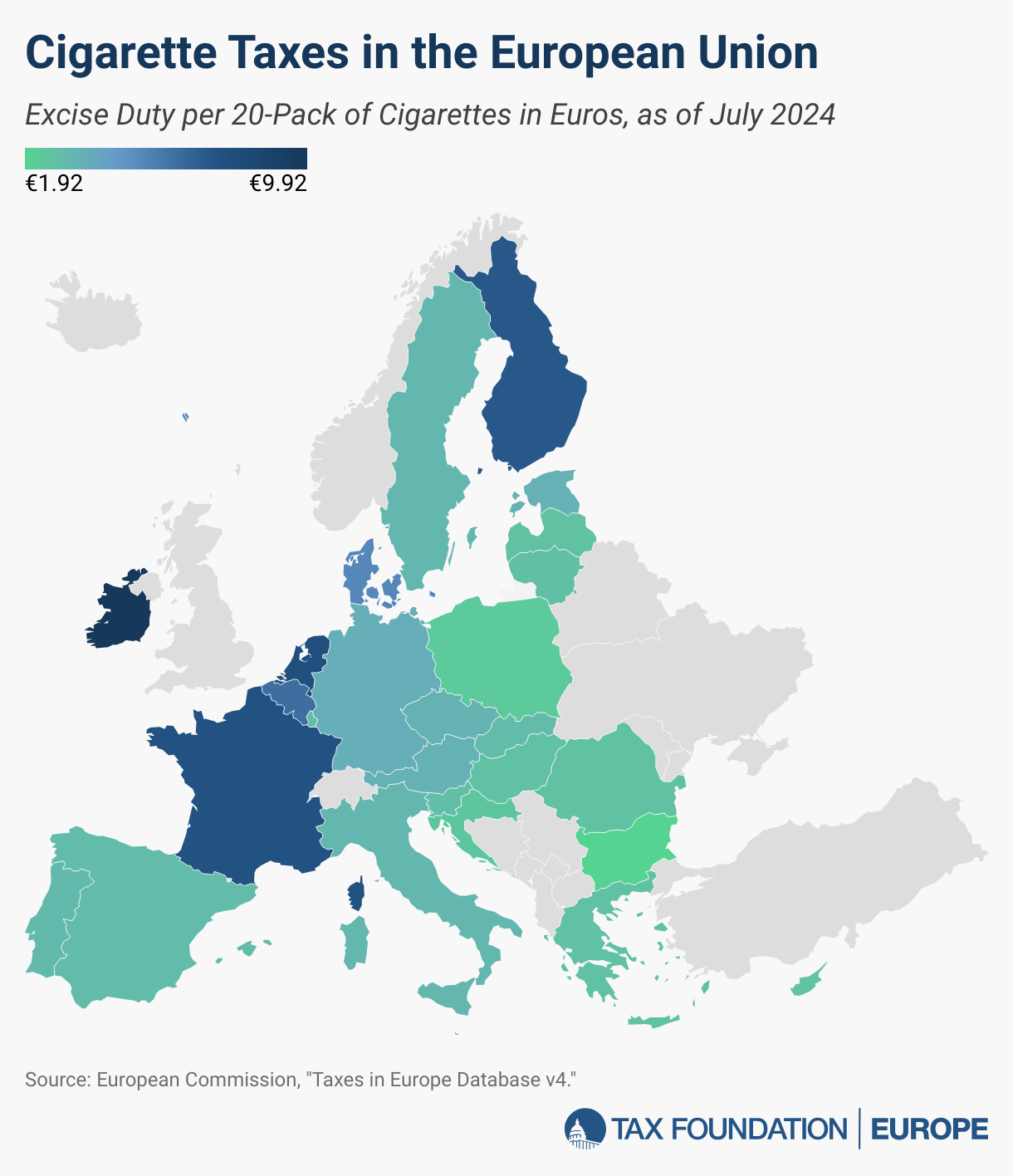
Cigarette Taxes in Europe are high and vary widely across countries. In fact, smokers pay more in taxes than on the cigarettes themselves. The EU requires member states to charge a minimum excise tax which is a fixed amount per pack of on cigarettes and other tobacco products. In addition EU countries add an additional percentage of the sales price which raises the prices more.

The highest taxes are in the developed EU countries while the lowest are in the East European countries of the EU. The following chart from the Tax Foundation shows the variance of cigarette taxes in Europe:

Click to enlarge

Source: Tax Foundation

For the full data of tax rates on all the countries click on the above link.

The Largest Global Banks By Market Value Change Over Time

A few years ago I wrote a post on how the largest companies change over time and it was well received by readers. Going back to that theme, in this post let’s take a took at how global banks also change over time. To put it another way, no company or bank tend to be at the top forever. As times change so do the leadership. I recently came across a piece at FirstLinks, Australia by Hugh Dive of Atlas Funds Management. The following charts are from that excellent article.

He noted that in early 1980s four of the top 10 global banks were French. But by 1990s they fell off the list as they were nationalized by the Mitterrand government.

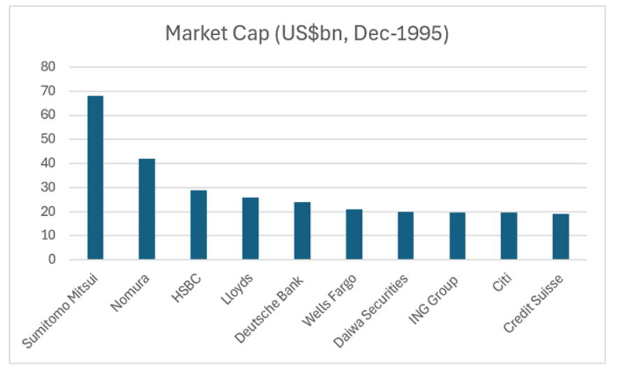
In 1995, Japanese banks appeared in the ranking with Sumitomo, Nomura and Daiwa as shown below. In addition European banks like Llyods(LYG), Deutsche Bank(DB), ING (ING), Credit Suisse and HSBC (HBC) dominated the list. That is no longer the case today as we see later in the post. In fact, Credit Suisse collapsed and was absorbed by UBS.

The World’s Top Banks by Market Cap in December,1995:

Click to enlarge

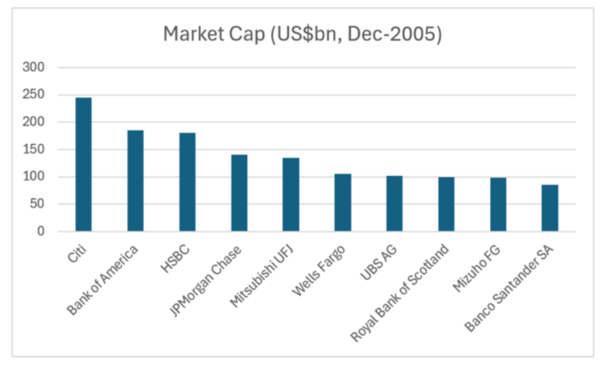
By 2005, US banks started attaining global leadership with Citi(C) at the top. Royal Bank of Scotland (RBS ) failed during the GFC and had to be bailed out by UK. Interestingly Spanish banking giant Santander (SAN) was the 10th largest bank at that time.

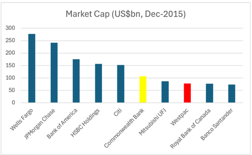
In 2015, two of Australia’s major banks – Westpac and Commonwealth(CMWAY) – appeared in the world’s largest 10 banks. Canadian banking group Royal Bank of Canada(RY) also reached this list.

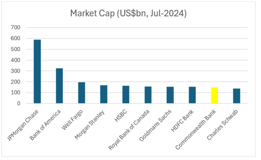
As mentioned earlier, leadership does not stay always with the same banks. In mid-2024, we see that American banks dominate the ranking. Westpac has dropped out and only Commonwealth Bank of Australia remain in the list. It should also be noted that one of India’s largest bank HDFC Bank(HDB) is now the 8th largest bank in the world. European banks have lost billions in market caps since the Global Financial Crisis and then multiple crises in the continent including many sovereign debt crisis over the years. No wonder most of them have disappeared from this list.

Source: Are Australian banks headed for a fall?, High Dive, Firstlinks

The key takeaway for investors in banking stocks is that leadership evolves over time and hence they should formulate their investment strategies accordingly.

Disclosure: Long SAN, ING, Westpac, RY

S&P 500 P/E Ratios by Sector: Chart

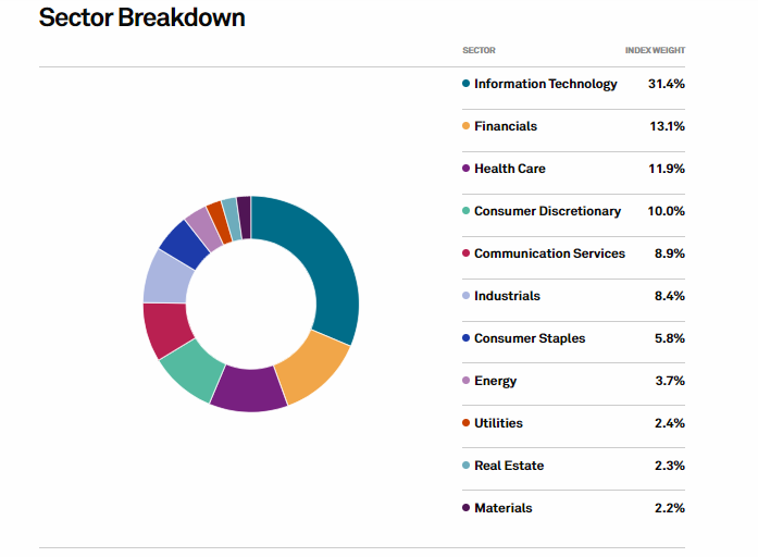
The S&P 500 is up a decent 11.52% on price-return basis as of yesterday August 8, 2024 despite the sell-off in the markets last week. The annualized return over the past 5 years is 12.61%. The tech sector as represented by Information Technology and Communication Services accounts for just over 40% of the index as shown in the chart below. Hence in some ways the direction of the index is heavily influenced by tech stocks.

S&P 500 Sectors by Weight:

Click to enlarge

Source: S&P 500

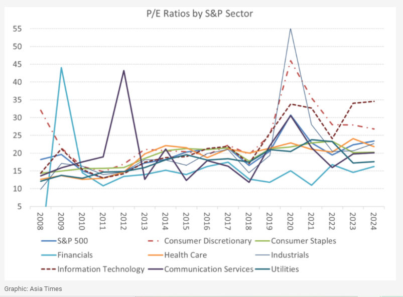
With that said the P/E ratio of the Information Technology sector remains elevated and is the highest of all the sectors in the index according to a recent article in Asia Times.

Click to enlarge

Source: A tale of two bubbles, Asia Times

As the US economic data continues to give mixed signals and the Fed is ready to reduce the interest rates soon, further volatility in equity markets can be expected. Investors need to be aware of this and act accordingly.

Related ETFs:

  1. SPDR S&P 500 ETF (SPY)
  2. iShares Core S&P 500 ETF (IVV)
  3. Vanguard S&P 500 ETF(VOO)
  4. SPDR Portfolio S&P 500 ETF  (SPLG)

Disclosure: No positions

U.S. Lags in Dividend Yield Relative to Other Regions

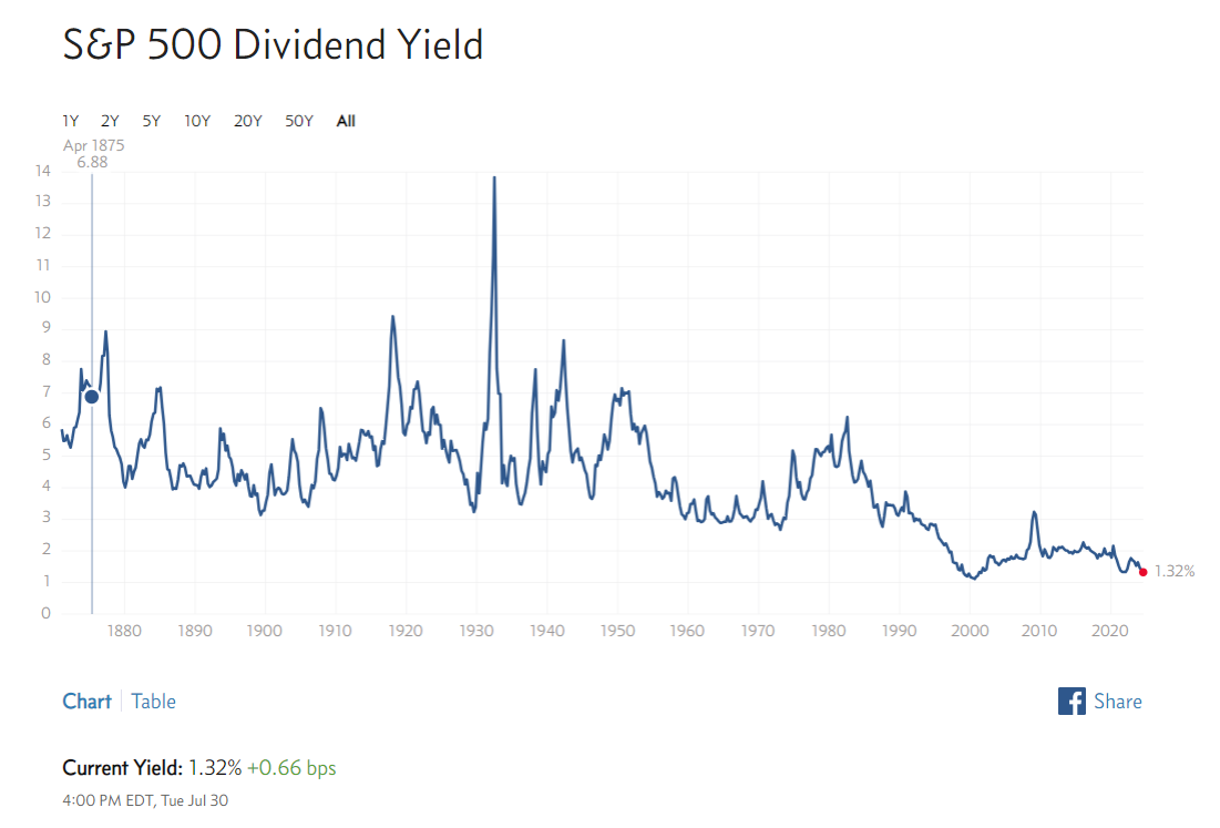
The U.S. lags many regions of the world in terms of dividend yields. Hence investors looking for income can find better opportunities outside of the country. The dividend yields on US stocks have been on the decline for many years now due to tax policy and other factors. Currently the yield on the S&P 500 is just 1.32% as shown in the chart below:

Click to enlarge

Source: multpl.com

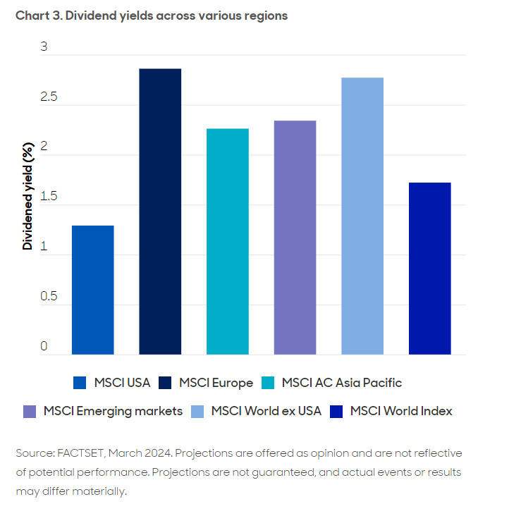
The following chart shows the dividend of various regions using the MSCI index. It shows European companies pay more than double the dividend yield of their U.S. peers. Even Emerging Markets have higher dividend yields than the U.S. The dividend culture in the US has eroded in the past few decades as the market has gravitated towards growth than income.

Click to enlarge

Source: Home bias blues? The case for international diversification, abrdn Investments

Related ETFs:

  • SPDR S&P 500 ETF (SPY)
  • iShares MSCI Emerging Markets ETF (EEM)
  • Vanguard MSCI Emerging Markets ETF (VWO)

Disclosure: No positions