Diversification is one of the simplest ways to be successful in equity investing. Diversification can take many forms. For example, one can hold a mix of stocks, bonds, gold, real estate and cash. Or it is possible to diversify across many types of equities such as domestic and foreign or emerging, developed and frontier markets. The key is to pick a strategy that best works for each of us. Recently I came across an excellent Vanguard research study that discussed the importance of diversification.
According to the study, broad market diversification cannot insure against losses but it can help reduce necessary large losses. During the 2008-09 Global Financial Crisis, the S&P 500 fell 37%. However many stocks in the index declined much more than that. Some even plunged by over 50%. Some of the companies that crashed heavily were thought of blue-chip dividend payers before. Most of these were in the financial sector. The following table shows how much losses these stocks had during that time. A portfolio heavy in this sector would have performed very poorly. On the other hand, there were also many stocks that generated strong returns in that awful year. Some of these were the best performers in the index.
Click to enlarge
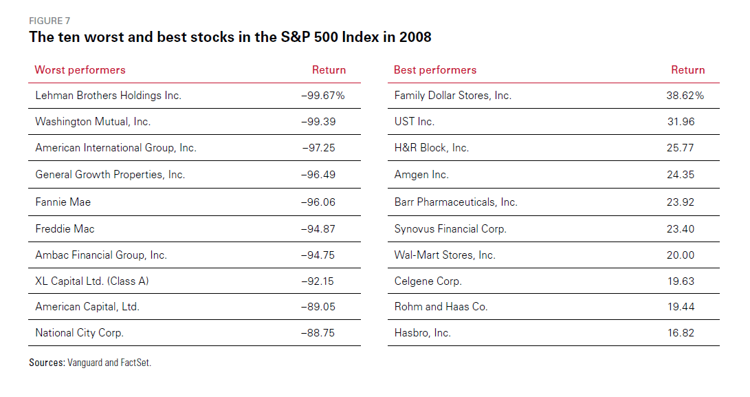
Source: Vanguard’s Principles for Investing Success, Vanguard
So the key takeaway is that broad diversification cannot totally avoid losses. But it can help avoid unnecessarily large losses. In the above scenario, an investor holding an S&P 500 index fund or a basket of stocks in different industries would have done relatively very well compared to an investor with a high concentration in financial services. So even a total wipeout of disasters like Lehman Brothers would be offset by other strong stocks.
Related ETF:
- SPDR S&P 500 ETF (SPY)
Disclosure: No Positions