Canadian railroad Canadian Pacific(CP) has seen its stock soar in the past five years by over 157% based on just price growth (excluding dividends). The NYSE-listed stock closed at over $371.00 today. With most of the major railroad stocks trading in triple digit dollar range, CP decided to split the stock.
Last week Canadian Pacific announced a 5-for-1 stock split. The Ex-date for the split is May 4, 2021 and the stock will trade on split-adjusted basis from May 14, 2021. Based on today’s close, the split should bring the price to around $75 per share. Lower stock prices generally attract more retail investors. So split could bring more investors to CP.
Last month CP agreed to buy Kansas City Southern (KSU) to create the first North American network that connects Canada, USA and Mexico. However rival Canadian National made a $30 billion bid topping CP’s offer. It remains to be seen who will emerge victorious in this battle of the big railroads.
The five-return comparison of major North American Class I railroad stocks are shown below:
Click to enlarge
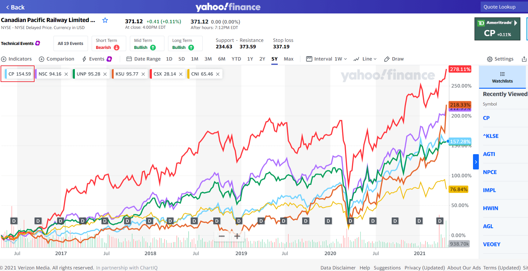
Source: Yahoo Finance
Disclosure: Long CNI, CSX, UNP and NSC