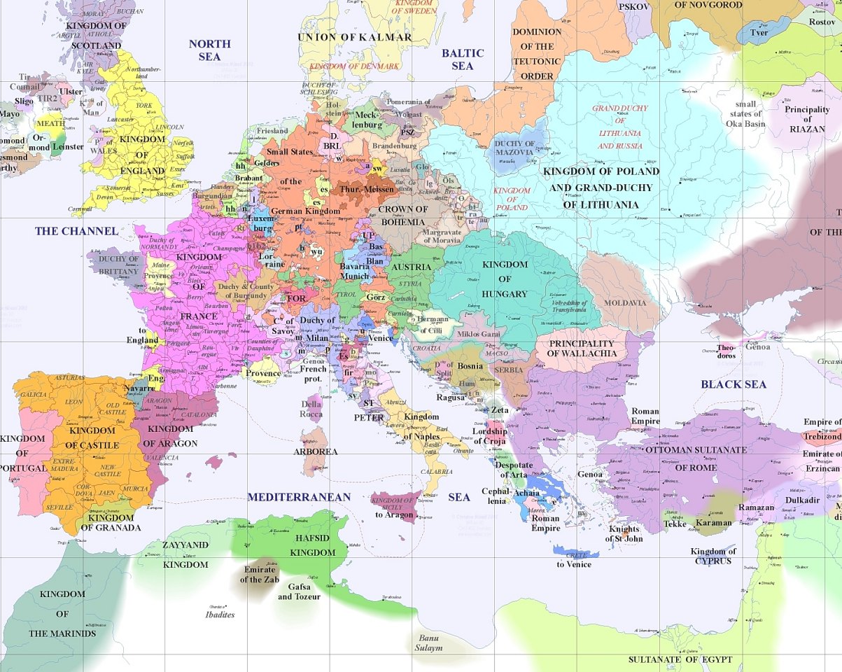
Map of Europe A.D. 1400 Posted by David Hunkar on 11 September 2020, 3:21 am The map of Europe in A.D. 1400 looked a lot different than now. Click to enlarge Source: Daily Infographics Related posts:Mutual Fund Assets under Management as a Percentage of GDP for Select Countries: ChartThe Top 20 Countries for Foreign Direct Investment (FDI) Outflows in 2025AI vs. The Power Grid: Infographic14 Interesting Facts From 1936