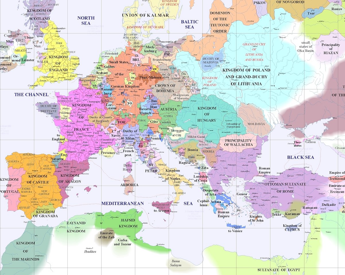
Map of Europe A.D. 1400 Posted by David Hunkar on 11 September 2020, 3:21 am The map of Europe in A.D. 1400 looked a lot different than now. Click to enlarge Source: Daily Infographics Related posts:The US National Debt Surpasses $38 Trillion: InfographicUS Average Effective Tariff Rate is Now Highest Since 1909: ChartAverage Electricity Price for Household Consumers in EU 2024: ChartKey Chip Suppliers for Apple Vision Pro: Chart