The coronavirus pandemic continues to ravage the US and other countries of the world. Compared to other developed countries the virus has hit the US hardest so far in terms of total cases and deaths. Below is the latest update from the New York Times:
At least 1,478 new coronavirus deaths and 54,187 new cases were reported in the United States on Aug. 12. Over the past week, there have been an average of 53,811 cases per day, a decrease of 17 percent from the average two weeks earlier.
As of Thursday evening, more than 5,260,900 people in the United States have been infected with the coronavirus and at least 167,100 have died, according to a New York Times database.
Source: Coronavirus in the U.S.: Latest Map and Case Count, NY Times
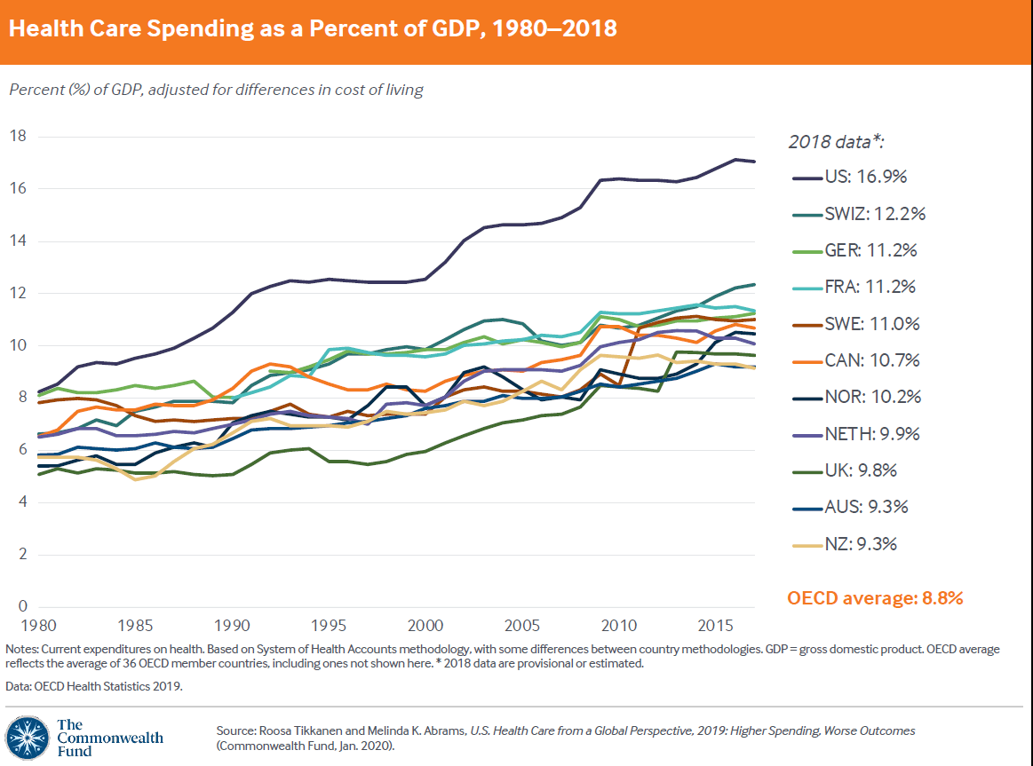
With that brief intro on let’s take a quick look at two charts on the health care system in the country.
1.Health care spending as percent of GDP:
Click to enlarge
2.Doctor Supply:
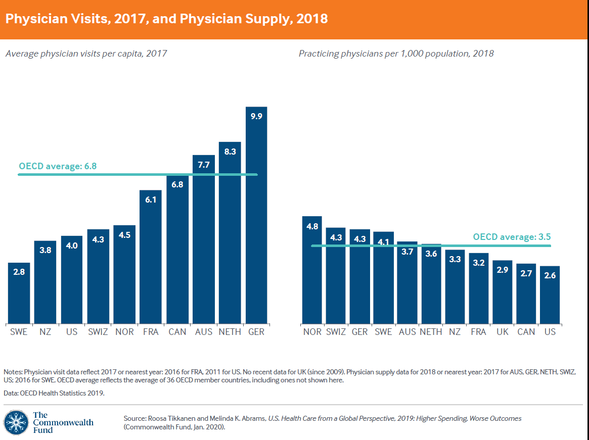
Source: U.S. Health Care from a Global Perspective, 2019: Higher Spending, Worse Outcomes? by Roosa Tikkanen and Melinda K. Abrams, The Commonwealth Fund
Here is another chart that shows doctors per capita in the US versus other countries:
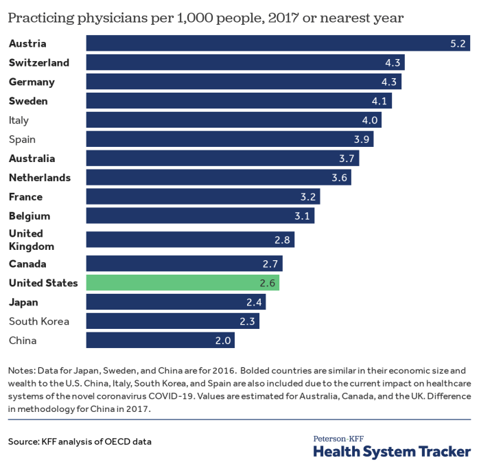
Source: The U.S. Has Fewer Physicians and Hospital Beds Per Capita Than Italy and Other Countries Overwhelmed by COVID-19, Kaiser Family Foundation