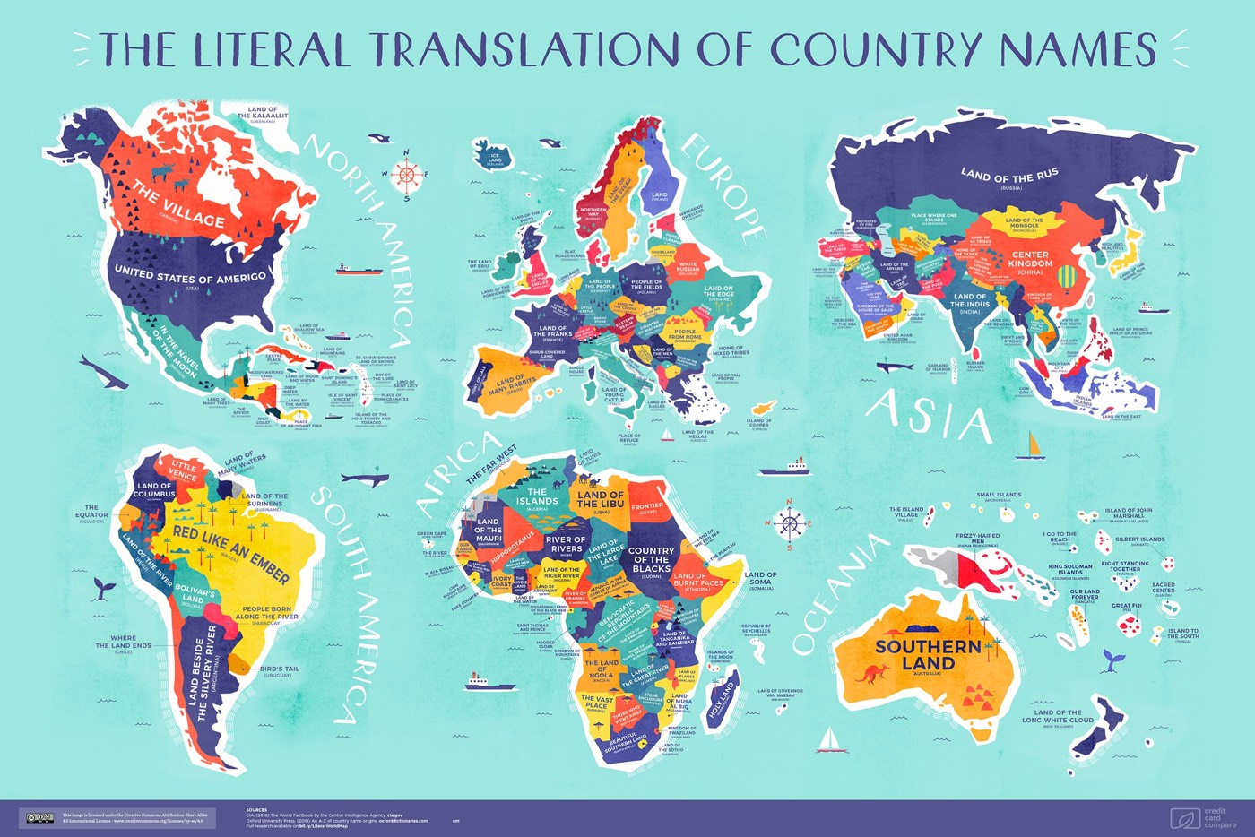
The Literal World Map: Chart Posted by David Hunkar on 28 March 2018, 3:21 am The following world map shows the literal translation of country names: Click to enlarge Source: Unknown Related posts:The US National Debt Surpasses $38 Trillion: InfographicUS Average Effective Tariff Rate is Now Highest Since 1909: ChartAverage Electricity Price for Household Consumers in EU 2024: ChartKey Chip Suppliers for Apple Vision Pro: Chart