One of the strategies that goes with diversification and patience is periodic investing. To put it another way, regular contributions into equity accounts and buying stocks can earn excellent returns over the long-term as measured in years. This is because with regular investing, an investor is able to pick up stocks on the cheap when markets are down. Not only that but the investor is able to accumulate more stocks for the same monthly investment in a portfolio. Of course, when markets are soaring equity prices will be higher and the investor will buy less of the same share for the same amount. This process is called dollar-cost averaging.
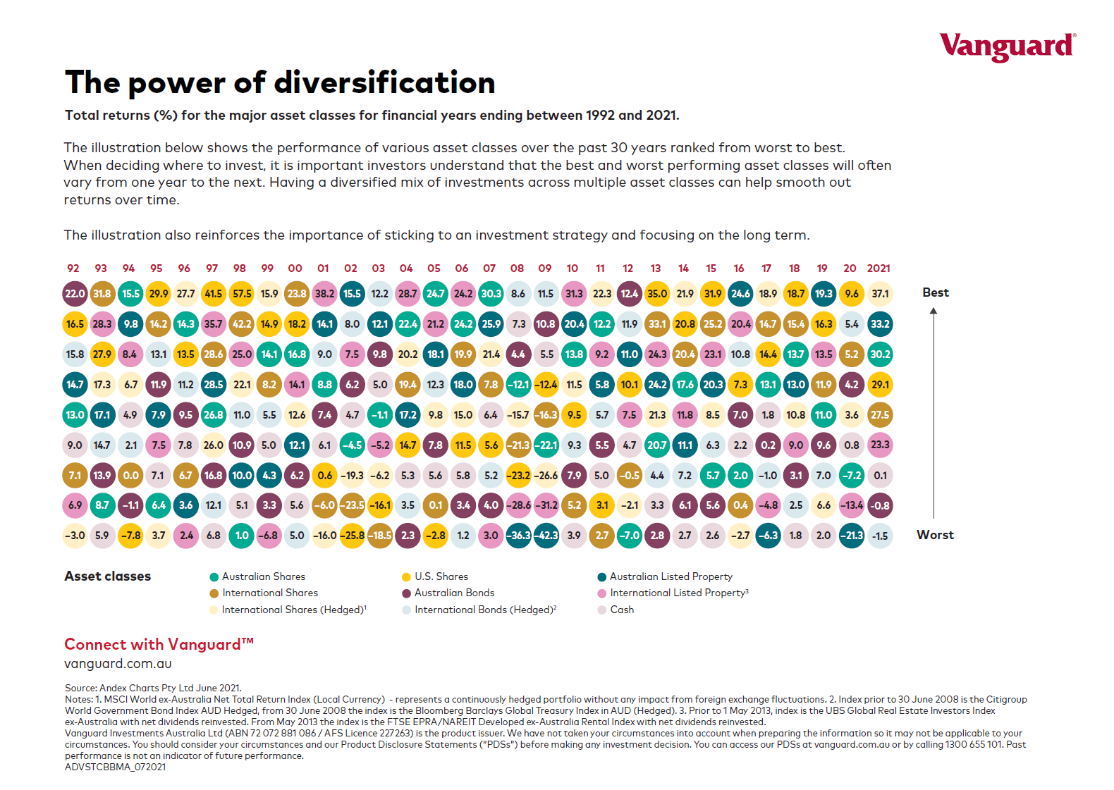
But over time, due to the effect of compounding the overall portfolio can generate great returns as shown in the Australian example below.
Before we get to that, below is an excerpt on the concept of “dollar cost averaging” from an article at Capital Group:
One way to avoid futile attempts to time the market is with dollar cost averaging, where a fixed amount of money is invested at regular intervals, regardless of market ups and downs. This approach creates a strategy in which more shares are purchased at lower prices and fewer shares are purchased at higher prices. Over time investors pay less, on average, per share. Regular investing does not ensure a profit or protect against loss. Investors should consider their willingness to keep investing when share prices are declining.
Retirement plans, to which investors make automatic contributions with every paycheck, are a prime example of dollar cost averaging.
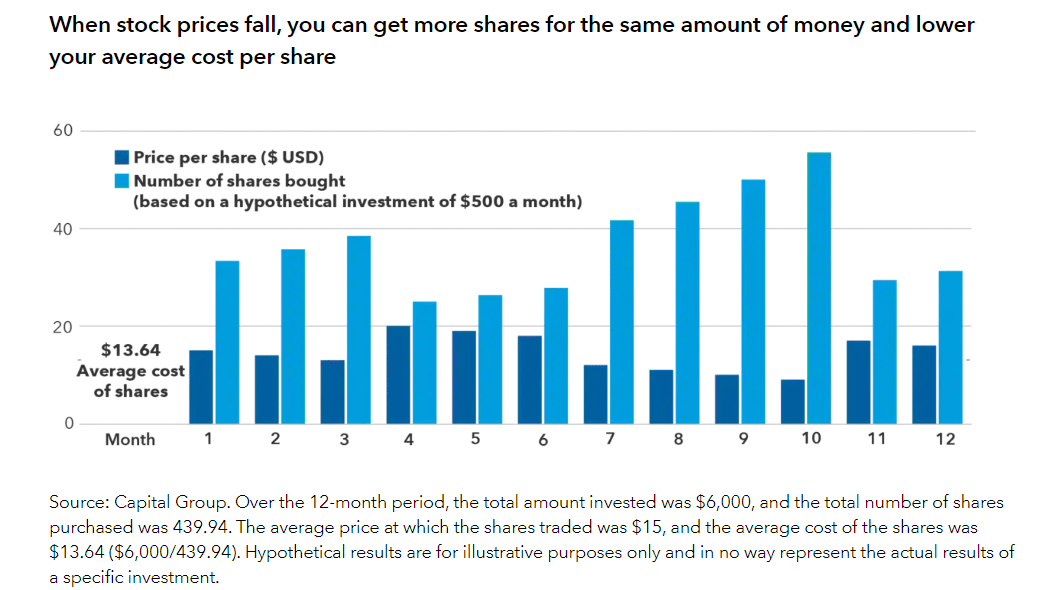
Source: How to handle market declines, Capital Group
The following chart from Vanguard Australia shows the benefits of periodic investing:
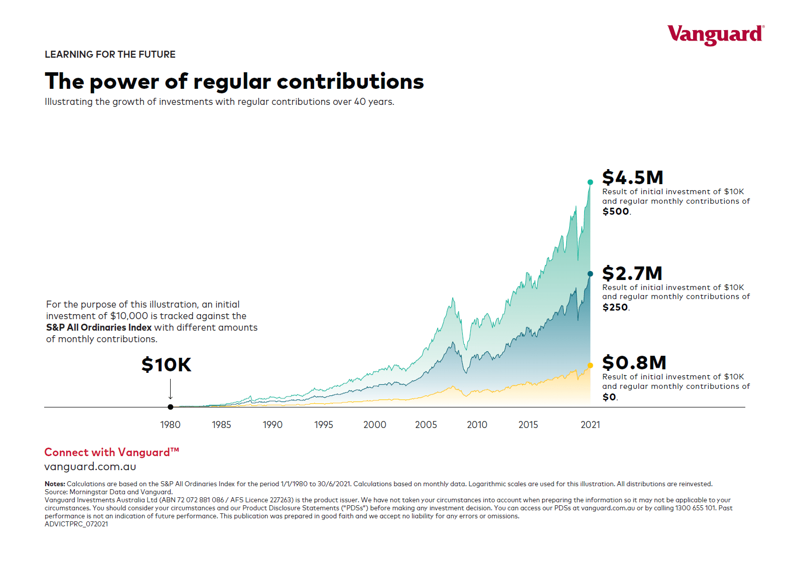
Source: Vanguard Australia
Related ETFs:
Disclosure: No Positions