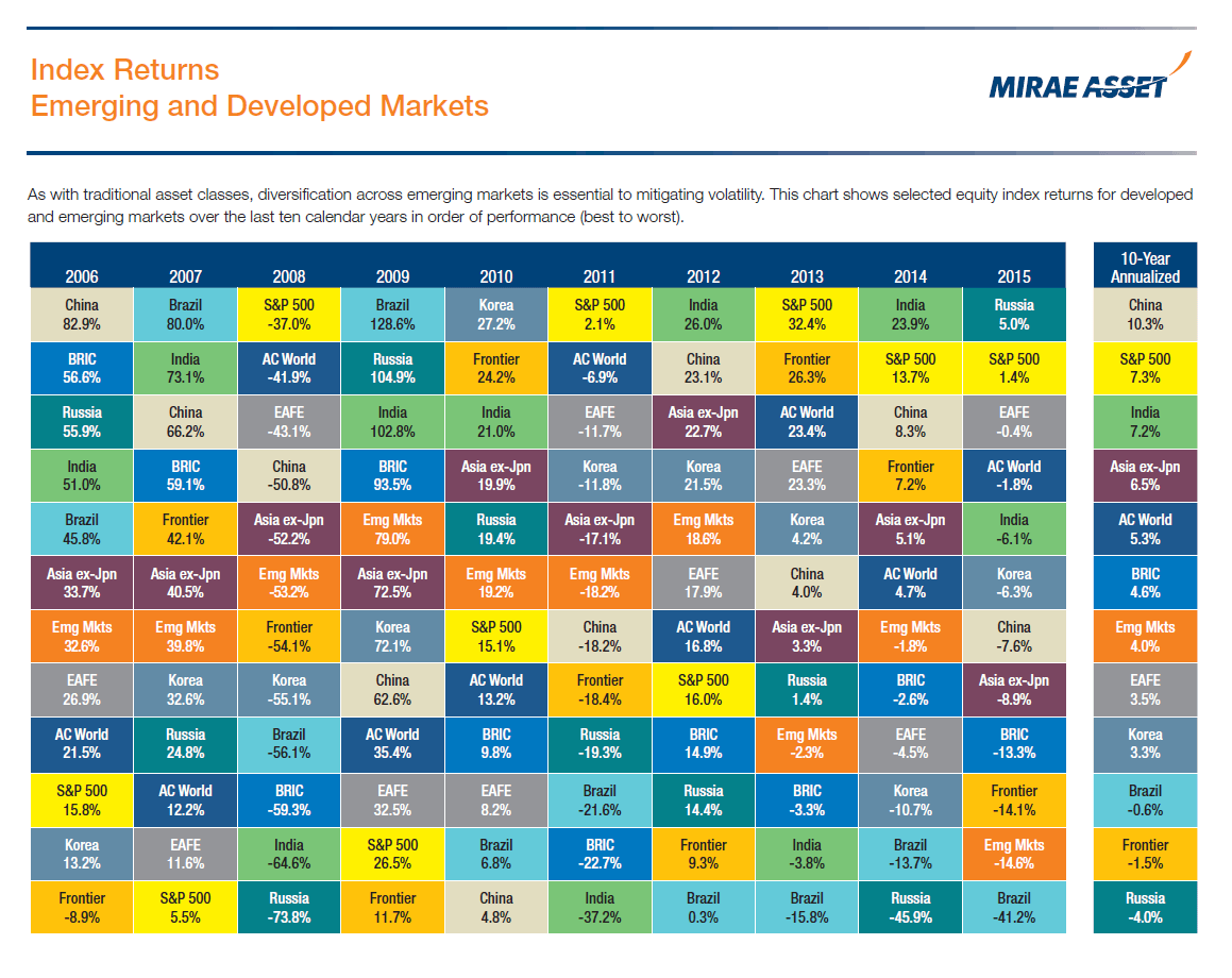
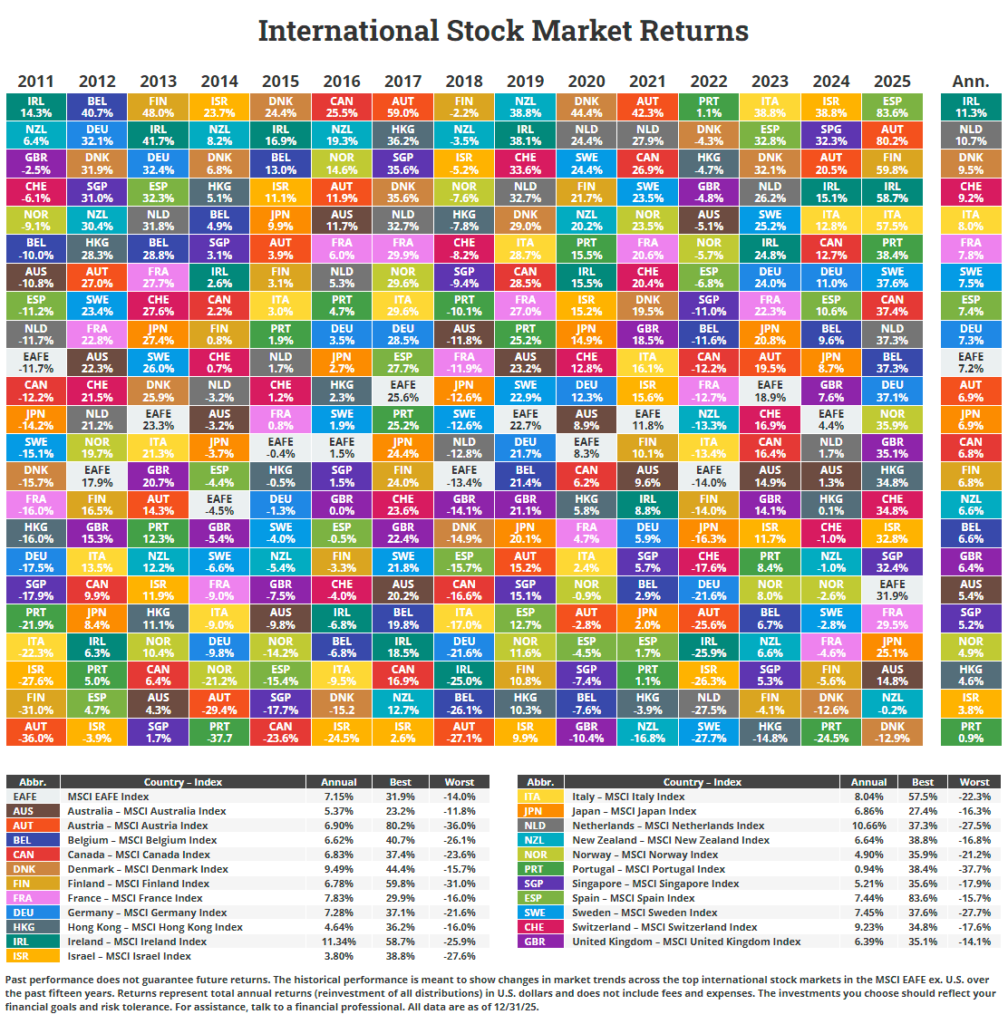
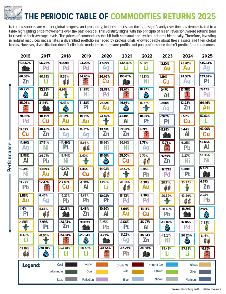
We have seen many charts earlier showing index returns of emerging markets, individual countries, developed markets, etc. Most of the charts showed the returns individually. I came across the following chart that compares the returns of emerging market index returns against developed markets:
Click to enlarge
Source: Mirae Asset Management
