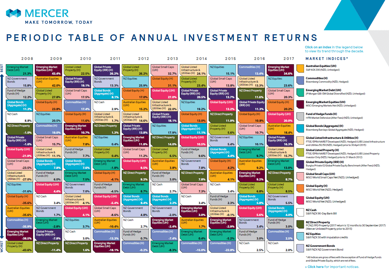
Mercer publishes The Periodic Table Of Investment Returns for New Zealand each year.Similar to the Callan Periodic Table, this chart offers a wealth of information from a New Zealand and Australian perspective. For example, the 2017 edition shows that NZ stocks (light blue color) earned nearly 24% compared to 18% for Aussie equities. Australian and NZ investors can use the chart below to analyze and educate themselves on the importance of diversification and other global investors may also find the chart useful in order to evaluate the returns of NZ and Aussie stocks relative to other assets.
The Periodic Table Of Investment Returns From 2008 To 2017 (New Zealand Edition):
Click to enlarge
Source: Mercer NZ
Download:
- The Periodic Table Of Investment Returns From 2008 To 2017 (in pdf format)