The following is a neat infographic to get an introduction to emerging markets. It also provides a comparison of the MSCI and FTSE emerging market indices.
Click to enlarge
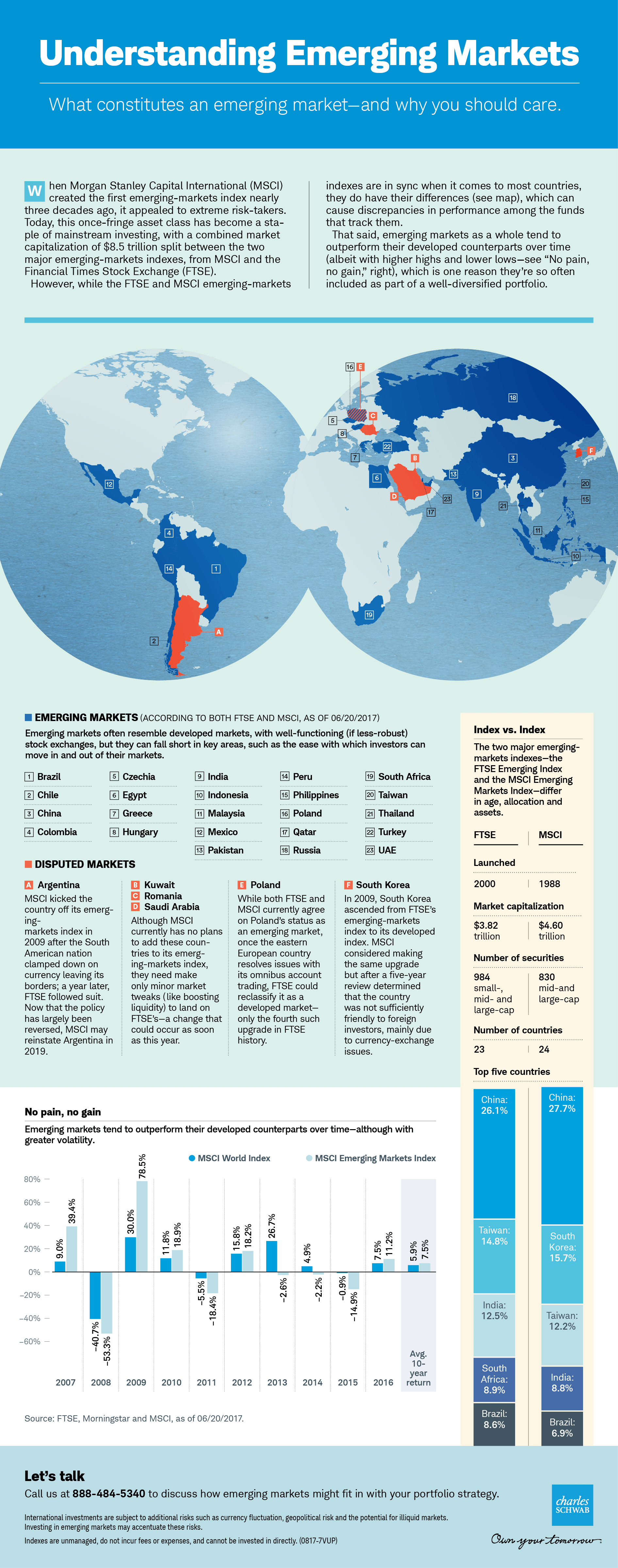
Note: The data in the above chart is from June, 2017.
Source: Schwab
The following is a neat infographic to get an introduction to emerging markets. It also provides a comparison of the MSCI and FTSE emerging market indices.
Click to enlarge
Note: The data in the above chart is from June, 2017.
Source: Schwab