Callan Associates has published their famous Periodic Table of Investment Returns for 2010. The chart below shows the annual returns for key indices from 1991 thru 2010 ranked in the order of performance:
Click to enlarge
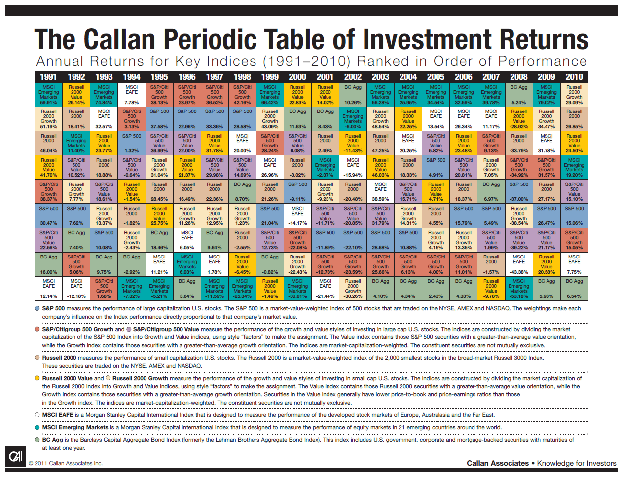
Source: Callan Associates
Some observations:
1. After raking up double digit gains in 2009, markets around the world gained further in 2010. U.S. markets performed better (15.1%) than the developed overseas markets which had a return of just 7.8.%.
2. Emerging markets completely erased the 53.2% loss of 2008 by rising 19.2% in 2010 and 79% in 2009.
3. For the second year in a row, all categories of equities had positive returns for the second year in a row.
4. Small caps(26.9%) outperformed large caps(15.1%) for the tenth year out of the last 12.
5. The S&P 500 yielded double digit returns two years in a row.
6. U.S. largecap stocks performed extremely well in the period from 1995 thru 1998 when the technology took off.
7. Once again this chart shows the importance of diversification since the returns of asset classes differ each year and sometimes there can be a reversal in pattern such as last year when U.S. stocks outperformed other developed market stocks.
Related posts:
The Callan Periodic Table of Investment Returns 2009Â
The Callan Periodic Table of Investment Returns for 2008
Why Diversification Still Matters
Related: The Callan Periodic Table of Investment Returns 2016: A Review