Checkout the following charts:
1.The Callan Period Table of Investment Returns (1988-2007)
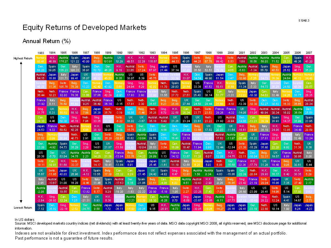
2. Callan’s – Equity Return of Developed Markets Chart
Checkout the following charts:
1.The Callan Period Table of Investment Returns (1988-2007)
2. Callan’s – Equity Return of Developed Markets Chart
Hi David,
it is good to see that you are now Seeking Alpha contributor.
Congratulation
Vlada
Hi Vlada
Yes.Finally they accepted me and my first article on Top 10 European utilities is posted there.We will see how it goes.
Thanks a lot
-David